designFAO
A versatile, playful and sophisticated visual identity.

The brief.
“I want to bring the spirit of the beach culture, food, sun, and good vibe Faro has to offer. The airport code is essential as it's been used for the conference name. Faro airport is what gets most people to the city, and I'd like it to be a symbol of connection.”
— Rui Barroca, Founder
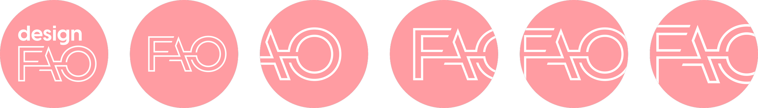
We decided the primary focus should be on the airport code element, making it versatile enough to create visually compelling compositions and a solid base for different materials.
To reinforce the concept of connection, the two lines that build the logo, reminiscing the tyre marks planes create on the pavement, possess playful and sophisticated qualities.
The logo is inspired by Faro's airport code, combining the location of the conference with the dynamism and creativity of the city on the Atlantic coast.


Final note.
The visual brand of designFAO is meant to be an ongoing experiment that will evolve over the coming editions of the event. I’m proud to have created a solid foundation for further iterations.
Check the branding in action at designfao.com